As we get older, finding time to see friends gets complicated.
Schedules fill and responsibilities pile up, making it a logistical ordeal to find a time that works for everyone. It’s no surprise then that a lot of us struggle to maintain active social lives, seeing friends far less often than we used to in the good ol’ days. This can make us feel disconnected, isolated, and even depressed.
Solution
I designed a mobile app to streamline the event scheduling process by consolidating the steps into one centralized platform.
Its user-friendly interface enables organizers to visualize their friends’ schedules and identify mutual availability at a glance. Potential timeslots can be nominated for a group poll, allowing friends to efficiently decide on a time that works best for everybody. Plus, everything sits on one app, so no more hunting down links or scrolling through old texts for meetup details!
Efficient
Plan Hangouts With Ease
Just put down a couple of details and suggest some times for your hangout. Don't worry - Hangout shows you when your friends are busy, making it easier to find openings in your group's schedule.
Collaborative
Vote on a Time That Works for Everyone
Our polling system keeps track of who prefers what so that you can avoid the chaotic back-and-forth in the group chat. Plus, with calendar integration, you won't need to open your calendar app to see what you have going on that day.
Organized
All Your Events, in One Place
View, edit, cancel, and withdraw from events, all in one hub. That's right: no more scrolling up and down old texts when you forget when you'd planned to hangout.
In order to design an improved scheduling system, I needed a deeper understanding of our user base, the current methods by which they're organize gatherings, and how these methods may or may not be meeting their needs.
To accomplish this, I conducted interviews with people at varying stages of their adulthood and ended up with a heap of information in the form of lengthy Google Documents and scattered notes. For the sake of clarity, I synthesized my findings in an affinity map using Miro. Presenting data in such a way helped me identify patterns and pain points that would later come in handy when brainstorming for solutions.
Based on conversations with groups of prospective users, I learned that:
People often schedule hangouts by texting back-and-forth in a group chat.
This can become repetitive and prone to redundancies.
Scheduling tools are often used for work, not personal lives.
This could be for a variety of reasons, including work-life separation, technophobia, and/or inertia.
Most people feel that scheduling is easier with a visual aid.
This rings true particularly for larger groups.
Empathizing
Fostering Empathy Using Personas & User Journey Maps
Empathizing
To put myself in the shoes of my personas, I created user journey that detail the series of physical and emotional experiences they might go through when planning a hangout. To be mindful of this means to understand the good and the bad parts of the process, which will be an immense help as I ideate features down the line.
Empathizing
Conducting a competitive audit to understand the strengths, patterns, and gaps we see in the current market.
Empathizing
Lastly, as the proverbial cherry-on-top of our user research process, I conducted a competitive audit to examine how existing scheduling tools in the market excel at helping people get together, as well as how they might fall short of that goal. I found that:
1. Many scheduling tools are branded as a productivity/workspace aid.
2. Most tools do not support multi-calendar integration.
3. Tools that do support multi-calendar integration don't support polling.
03. DESIGN
Ideation
Feature Exploration & Prioritization
After conducting my research, I felt better equipped to create something comprehensive: an app that supports polling, provides a collective visualization of a group’s availability via calendar integration, and diverges from the typical productivity focus by catering to everyday individuals seeking to enjoy time with friends and family.
As I moved into the design stage, my goal was to push my own boundaries and try to think of unique ways to achieve these elements in my design, so I tried to get as many ideas down as I could without much consideration for feasibility (yet). Then, I grouped them into categories to make the following mindmap.
Next came prioritization. I performed a MoSCoW analysis to systematically prioritize features by categorizing them into must-haves, should-haves, could-haves, and won’t-haves, all the while considering both feasibility of implementation and significance of each feature to the user experience. This approach provided me with a clear focus by highlighting which key features to address first when I begin wireframing.
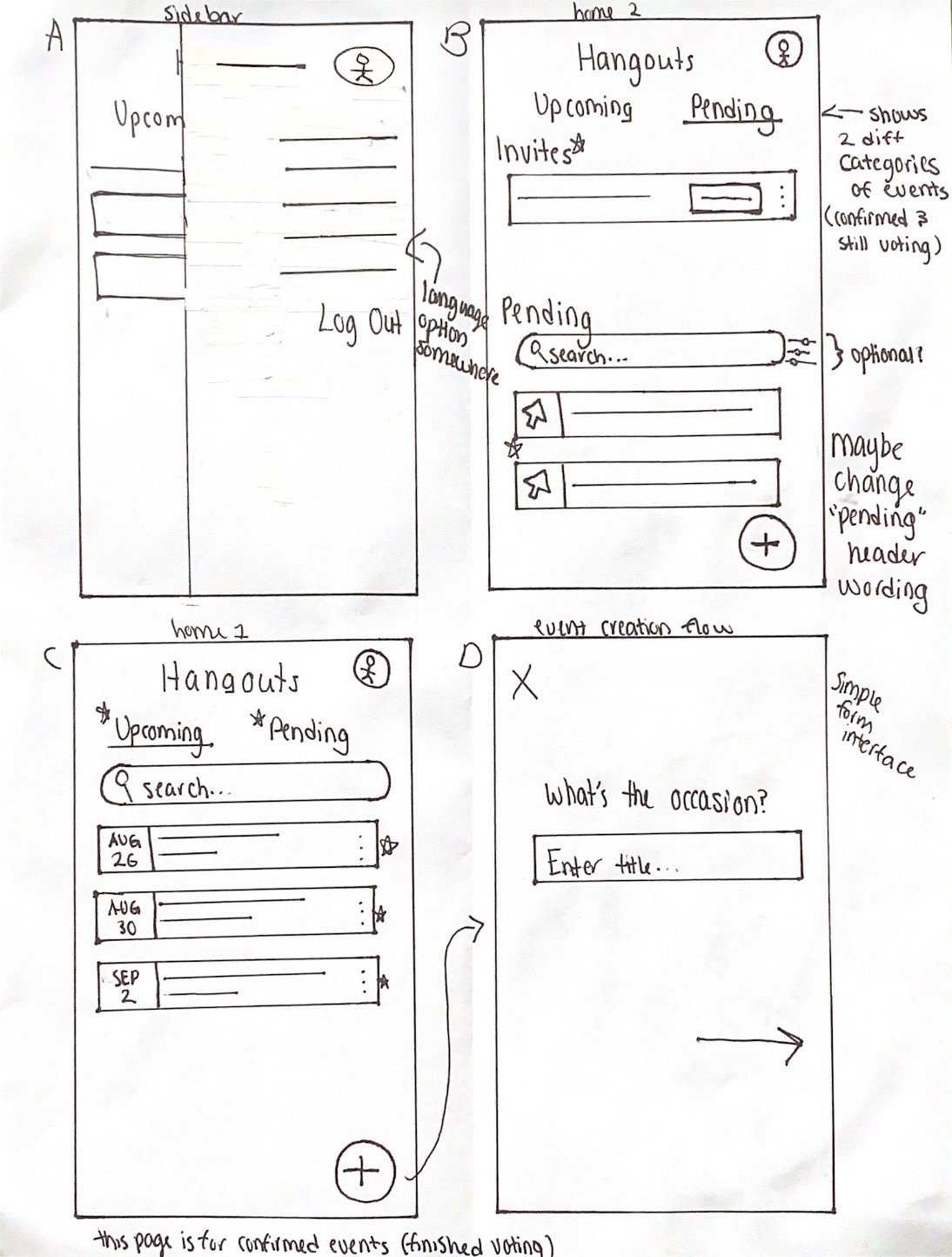
Wireframing
Designing the Initial Concepts
Wireframing
Before going digital, I first sketched out some ideas on paper to explore their viabilities and narrowed in on the designs I liked. Here are the final wireframes I created for the main screens and user flow (that is, creating an event):
Once I had wireframed each feature, I transitioned to creating mockups and a low-fidelity prototype to present to potential users for feedback.
User Feedback & Design Revisions
Stop and Check: Are We on the Right Track?
I conducted a first round of user testing to validate whether my designs are working as intended. I grouped my findings into three categories, and for each of them I devised action points to guide the improvement efforts I’ll be making in the second iteration of the design.
The concept of pooling schedules works best when everyone syncs their personal calendars to the app.
Ensure that the benefits of calendar syncing are made clear to users through effective communication during onboarding process
To ease privacy concerns, anonymize all events synced from personal schedules
The app lacked some key features for seamlessly organizing events.
Add a location picker
Add an overview page at the end of the event creation process
Allow participants to view the status of ongoing polls, such as who voted for what
Users experienced confusion navigating certain features of Hangout.
Make navigation clearer by replacing icons with text
Opt for action-oriented verbs that align with the physical action the user is expected to perform. (e.g. "tap to vote" instead of “vote on a time”)
Mockups & Prototyping
High-Fidelity Design: Main User Flow
Wireframing
Using the insights from user testing at the forefront of my design decisions, I created the first iteration of my high-fidelity prototype on Figma. The design contains some modified elements from Google’s Material 3 Design Kit.
RSVP
Wireframing
Upcoming Event: Host & Respondent Views
Wireframing
Design System
Wireframing
04. ITERATE
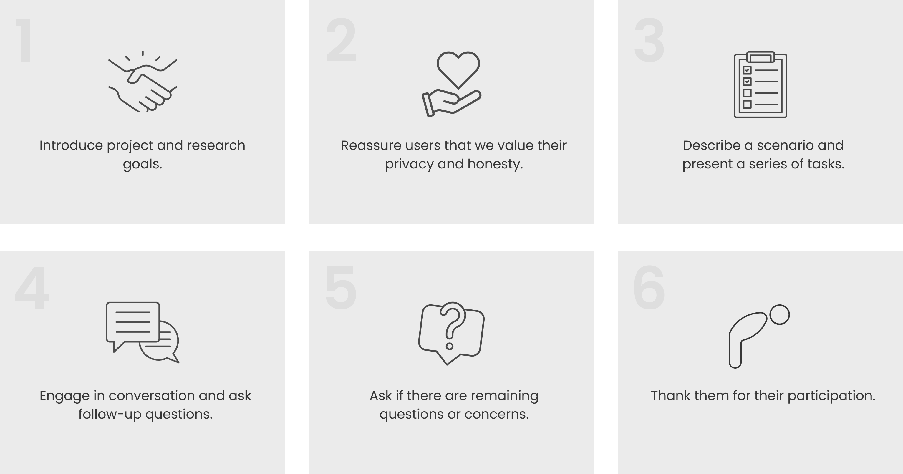
Usability Testing
Creating a Moderated Usability Testing Plan
Now that my first iteration of a high-fidelity prototype was complete, I needed to conduct a second round of moderated usability studies to measure how well my design achieved the goals I had set. I recruited a new batch of users this time, again ensuring that they were from varying stages of adulthood and lived a diverse range of lifestyles so that my app could be evaluated from multiple perspectives.
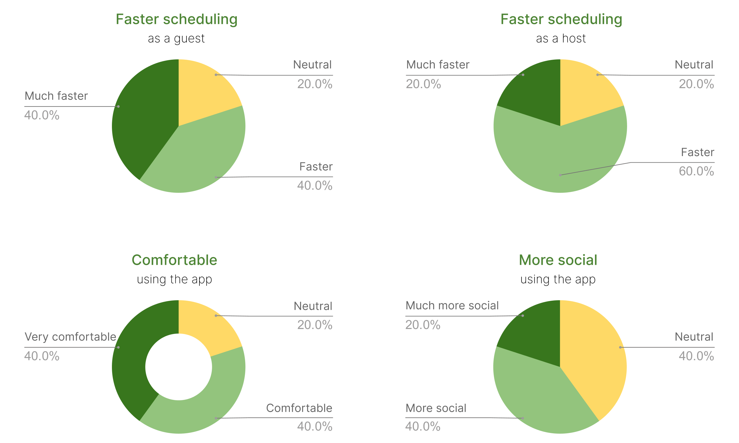
To make an objective and quantitative assessment of my design, I created a set of Likert-scale questions, each of which are tailored to measure the efficacy of a specific design goal. Users can respond to these statements on a 5-point scale.
Analyzing User Feedback to Inform Design Iterations
I also received lots of qualitative feedback during testing, which I again processed by creating an affinity map. From here, I identified recurring issues so that I could strategically address them in my design iterations.
01
Redesign
Multi-Day View
| Multi-Day View
📝 TESTING INSIGHT
Single-day view can be limiting. Some users would like to see the calendar for multiple days at a time.
✔️ SOLUTION
I added a multi-day view (up to 3 days) so that users may review schedules across multiple days in one glance, enabling quicker recognition of mutual availability. The rationale for picking 3 days is that fitting any more on a mobile screen may cause the calendar get too packed and hinder readability.
02
Redesign
Gesture Animations
| Edit Invitee List
📝 TESTING INSIGHT
Some users were uncertain about how to interact with the timeslot selection screen.
✔️ SOLUTION
I added brief gesture animations to provide some guidance. This animation would apply only to those carrying out the user flow for the first time.
03
Redesign
Edit Invitee List
| Edit Invitee List
📝 TESTING INSIGHT
Users may forget to include someone in their invitation.
✔️ SOLUTION
To allow users to invite friends after-the-fact, I made the invitees list an editable field, whereas it was previously greyed out along with other non-modifiable details.
05. PROTOTYPE
06. TAKEAWAYS
Focus on building an MVP.
The first drafts don't need to be perfect, so don't get bogged down by little details. Prioritize the high-impact features that matter most to users, and consider the UX just as much as the UI when doing so. If I catch myself leaning into the screen and squinting as I move something two pixels to the right, I need to take a break and reset.
Build what users want, not what you think they want.
Putting the user at the forefront of the design process leads to more intuitive and user-friendly products. Putting yourself at the forefront leads to a lot of design overhauling down the line.
Don't reinvent the wheel.
Figma has a community - use it! There's a library for everything, and by using public components for universal elements (such as keyboards) that don't have much bearing on the UX, I can save a lot of time that could be better spent elsewhere on the project.
.png)


.png)


.png)
%20(6).png)


.png)
.png)
